Alokai
Deliverables:
Brand Identity, Design System, Web Design, Illustration system
Alokai
Deliverables:
Brand Identity, Design System, Web Design, Illustration system
Alokai
Deliverables:
Brand Identity, Design System, Web Design, Illustration system

Alokai is a comprehensive Frontend as a Service solution that helps you build, deploy, and manage ecommerce storefronts.
Alokai is a comprehensive Frontend as a Service solution that helps you build, deploy, and manage ecommerce storefronts.
Alokai is a comprehensive Frontend as a Service solution that helps you build, deploy, and manage ecommerce storefronts.
The challenge
Complete rebranding, including changing the brand name and redesigning the website. Our goal was not only to refresh the brand's image but also to improve user experience by clearly conveying its values and facilitating navigation on the site. Determining the artistic direction of the brand, explaining to the user a rather complex project, and finding a visual metaphor for integration, which is a key aspect of the product. We retained the brand's existing colors (green).
The challenge
Complete rebranding, including changing the brand name and redesigning the website. Our goal was not only to refresh the brand's image but also to improve user experience by clearly conveying its values and facilitating navigation on the site. Determining the artistic direction of the brand, explaining to the user a rather complex project, and finding a visual metaphor for integration, which is a key aspect of the product. We retained the brand's existing colors (green).
The challenge
Complete rebranding, including changing the brand name and redesigning the website. Our goal was not only to refresh the brand's image but also to improve user experience by clearly conveying its values and facilitating navigation on the site. Determining the artistic direction of the brand, explaining to the user a rather complex project, and finding a visual metaphor for integration, which is a key aspect of the product. We retained the brand's existing colors (green).

Alokai deals with transferring data from various sources and integrating them, as well as customization. Shapes connected to each other serve as an analogy for integration and data merging, rounded shapes with indentations reflect the plastic structure of an atom, allowing the user to customize the final project by using Alokai. Shapes merging together are like the integration with Alokai.
Alokai deals with transferring data from various sources and integrating them, as well as customization. Shapes connected to each other serve as an analogy for integration and data merging, rounded shapes with indentations reflect the plastic structure of an atom, allowing the user to customize the final project by using Alokai. Shapes merging together are like the integration with Alokai.
Alokai deals with transferring data from various sources and integrating them, as well as customization. Shapes connected to each other serve as an analogy for integration and data merging, rounded shapes with indentations reflect the plastic structure of an atom, allowing the user to customize the final project by using Alokai. Shapes merging together are like the integration with Alokai.

The main and leading typeface of the brand was chosen as Spline Sans - it is a sans-serif, single-element typeface characterized by rounded notches appearing in some characters - this unique element of Spline Sans perfectly complements the brand's shapes. As a complementary typeface for use in the main text, the universal Inter typeface was chosen - although similar to the headline typeface, it functions better for smaller text.
The main and leading typeface of the brand was chosen as Spline Sans - it is a sans-serif, single-element typeface characterized by rounded notches appearing in some characters - this unique element of Spline Sans perfectly complements the brand's shapes. As a complementary typeface for use in the main text, the universal Inter typeface was chosen - although similar to the headline typeface, it functions better for smaller text.

One of the main requirements of the rebranding was to maintain the green color, which is a distinctive point of the brand and what it is associated with. The green color was appropriately adjusted, and the entire palette was complemented with broken white and black.
One of the main requirements of the rebranding was to maintain the green color, which is a distinctive point of the brand and what it is associated with. The green color was appropriately adjusted, and the entire palette was complemented with broken white and black.


The main goal of my role in the rebranding and redesign of Alokai was to create the homepage. One of the requirements was to limit the number of unique components and reuse elements across subsequent subpages. In this way, a page consisting of several sections was designed. To distinguish sections, the brand shape was applied on the background.
The main goal of my role in the rebranding and redesign of Alokai was to create the homepage. One of the requirements was to limit the number of unique components and reuse elements across subsequent subpages. In this way, a page consisting of several sections was designed. To distinguish sections, the brand shape was applied on the background.

As part of the project, a basic Design System was created, which includes basic elements such as a color system, typographic system, and basic components.
As part of the project, a basic Design System was created, which includes basic elements such as a color system, typographic system, and basic components.

Results
Delivered a complete rebrand and homepage redesign in roughly four months, resolving all five issues identified in the initial audit — inconsistent visuals, competing colors, cluttered components, poor contrast, and mismatched illustration style.
The new design system and illustration library were built for reuse across teams — components were structured so other designers and subcontractors could apply them consistently, and the illustration system was specifically designed as a component library for that purpose. The homepage itself was built with a limited set of reusable components, keeping the site scalable as new pages were added.
The project also carried real business weight: it launched alongside the company's name change from VSF to Alokai, meaning the new brand was the client's first impression under its new identity.
Results
Delivered a complete rebrand and homepage redesign in roughly four months, resolving all five issues identified in the initial audit — inconsistent visuals, competing colors, cluttered components, poor contrast, and mismatched illustration style.
The new design system and illustration library were built for reuse across teams — components were structured so other designers and subcontractors could apply them consistently, and the illustration system was specifically designed as a component library for that purpose. The homepage itself was built with a limited set of reusable components, keeping the site scalable as new pages were added.
The project also carried real business weight: it launched alongside the company's name change from VSF to Alokai, meaning the new brand was the client's first impression under its new identity.
The Process
Data:
November 2023 – February 2024
The Process
Data:
November 2023 – February 2024
The Process
Data:
November 2023 – February 2024
Project Gaols
Delivering a clear message about our company's purpose. Fostering inclusivity across technical, marketing, and sales teams. Prioritizing the reusability of pages and templates
Project Gaols
Delivering a clear message about our company's purpose. Fostering inclusivity across technical, marketing, and sales teams. Prioritizing the reusability of pages and templates
Project Gaols
Delivering a clear message about our company's purpose. Fostering inclusivity across technical, marketing, and sales teams. Prioritizing the reusability of pages and templates
Goal & Scope identification
At the project's outset, VSF had recently revamped its homepage. Initially tasked with developing subsequent subpages like product LP, blog, and pricing, our scope expanded during Goal & Scope Identification and UX/UI Audit. Collaborating with the client, we opted to redesign the website entirely and rebrand due to an impending company name change (from VSF to Alokai).
Goal & Scope identification
At the project's outset, VSF had recently revamped its homepage. Initially tasked with developing subsequent subpages like product LP, blog, and pricing, our scope expanded during Goal & Scope Identification and UX/UI Audit. Collaborating with the client, we opted to redesign the website entirely and rebrand due to an impending company name change (from VSF to Alokai).
Goal & Scope identification
At the project's outset, VSF had recently revamped its homepage. Initially tasked with developing subsequent subpages like product LP, blog, and pricing, our scope expanded during Goal & Scope Identification and UX/UI Audit. Collaborating with the client, we opted to redesign the website entirely and rebrand due to an impending company name change (from VSF to Alokai).

UX/UI Audit
UX/UI Audit
During the website audit, I identified five key issues:
Lack of graphical consistency
Overuse of secondary color (purple) overshadowing the primary brand color (green)
Busy components lacking spacing, featuring small typography, excessive elements, and lacking hierarchy
Inconsistency in green color application, poor color correlation, gradient issues, and failure to meet contrast requirements.
Inconsistency in illustrations, also being too playful.

Analysis of existing data
After analyzing gathered data, we prioritized website sections and set a project requirement to limit page length.
Analysis of existing data
After analyzing gathered data, we prioritized website sections and set a project requirement to limit page length.

Branding discovery
Conducted Branding Discovery workshops to establish the project's artistic direction and select appropriate visual elements for the company. Subsequently, I summarized and highlighted the key keywords associated with the proposed direction.
Branding discovery
Conducted Branding Discovery workshops to establish the project's artistic direction and select appropriate visual elements for the company. Subsequently, I summarized and highlighted the key keywords associated with the proposed direction.

User Flows


Moodboards
Created three diverse moodboards to offer flexibility in choosing the brand direction without restricting to a single idea.
Moodboards
Created three diverse moodboards to offer flexibility in choosing the brand direction without restricting to a single idea.

Branding
Presented branding ideas to the client, showcasing examples of their application.
Branding
Presented branding ideas to the client, showcasing examples of their application.

Presentation of Branding
Style
To visualise my idea for Key Visual I created “Style Tiles” where I presented colors, typography, key components and mockups samples.
Style
To visualise my idea for Key Visual I created “Style Tiles” where I presented colors, typography, key components and mockups samples.

Shapes ideas
UI Graphics explorations
Recognizing interface and code integration as integral parts of the product, I designed sample graphics as part of the branding process.
UI Graphics explorations
Recognizing interface and code integration as integral parts of the product, I designed sample graphics as part of the branding process.

Illustration system
To ensure consistency and efficient illustration creation, I designed an illustrative system with a component library for internal and subcontractor use.
Illustration system
To ensure consistency and efficient illustration creation, I designed an illustrative system with a component library for internal and subcontractor use.

Sections visual exploration
Upon receiving content guidelines from the client, I creatively explored various solutions for the designated homepage sections, unleashing my creativity to generate diverse ideas.
Sections visual exploration
Upon receiving content guidelines from the client, I creatively explored various solutions for the designated homepage sections, unleashing my creativity to generate diverse ideas.

Sections explorations

Sections explorations
Mid-Fi
With a clear visual direction established and many ideas generated during branding work, coupled with the client's provision of Lo-Fi, I proceeded directly to Mid-Fi design work.
Mid-Fi
With a clear visual direction established and many ideas generated during branding work, coupled with the client's provision of Lo-Fi, I proceeded directly to Mid-Fi design work.
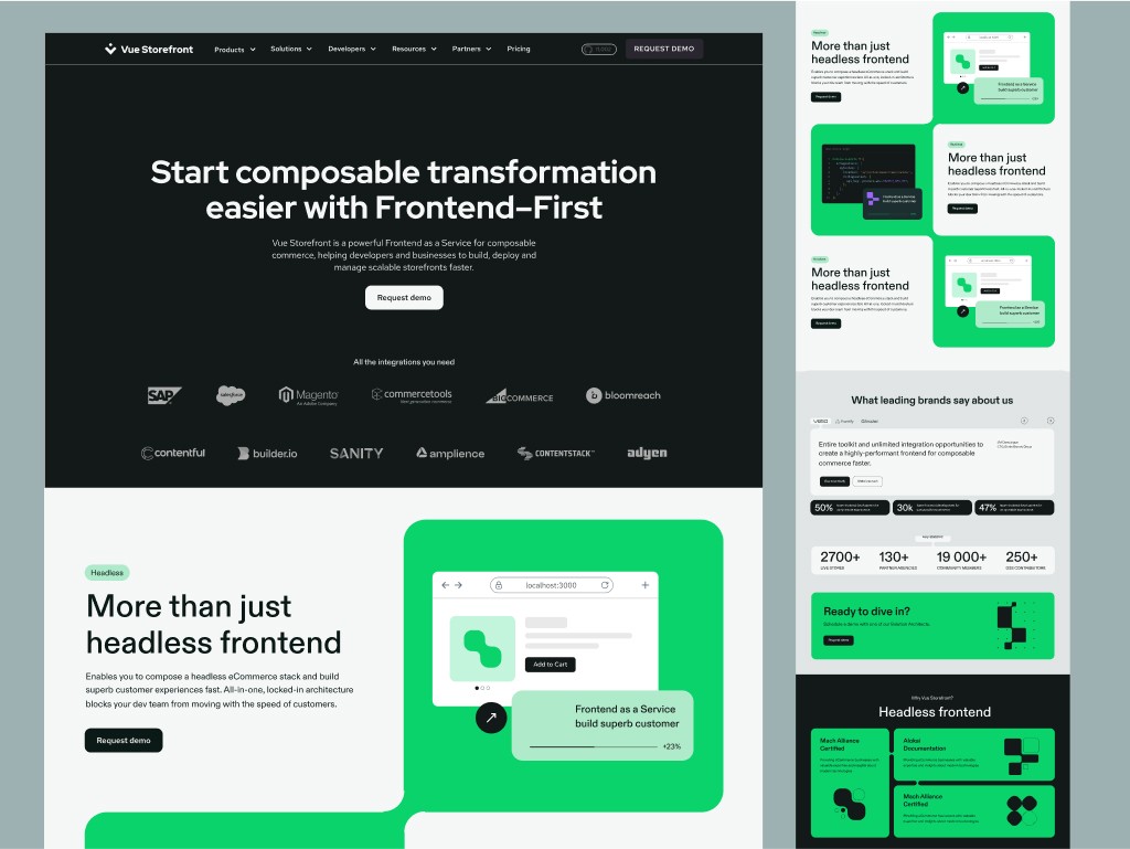
Explanation for design decision
There is a design reason behind every decision. A clear argument for my design decisions makes it easier to make decisions about the product and illustrates the logic I followed when making them.
Explanation for design decision
There is a design reason behind every decision. A clear argument for my design decisions makes it easier to make decisions about the product and illustrates the logic I followed when making them.

Redesign comparison
The website has undergone a significant visual transformation and has been improved in terms of UX. I achieved consistency, transparency and uniqueness due to creative design
Redesign comparison
The website has undergone a significant visual transformation and has been improved in terms of UX. I achieved consistency, transparency and uniqueness due to creative design


SEE NEXT PROJECTS


OSKAR TOMECKI
OSKAR TOMECKI