CreatorHero
Deliverables:
App Design, Design System, Web Design
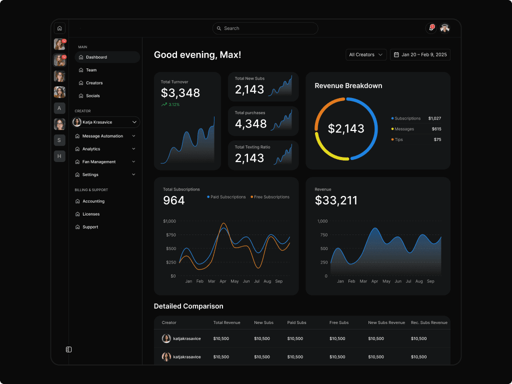
CreatorHero is a B2B SaaS platform that helps creator economy agencies manage their teams, automate fan communication, and scale their operations across multiple accounts.
CreatorHero is a B2B SaaS platform that helps creator economy agencies manage their teams, automate fan communication, and scale their operations across multiple accounts.
CreatorHero is a B2B SaaS platform that helps creator economy agencies manage their teams, automate fan communication, and scale their operations across multiple accounts.


The Process
Data:
July 2024 – May 2026
The Process
Data:
July 2024 – May 2026
The Process
Data:
July 2024 – May 2026
The challenge
CreatorHero had grown fast — but design hadn't kept pace. The product served 2,000+ agencies across a 34-page application with no coherent design system, inconsistent UI, and an onboarding experience that left new users without clear direction. The challenge was to understand what was truly broken before touching any screen, rebuild the design foundation, and deliver a product that users could trust and navigate with confidence.
The challenge
CreatorHero had grown fast — but design hadn't kept pace. The product served 2,000+ agencies across a 34-page application with no coherent design system, inconsistent UI, and an onboarding experience that left new users without clear direction. The challenge was to understand what was truly broken before touching any screen, rebuild the design foundation, and deliver a product that users could trust and navigate with confidence.
What I worked on
• UX Research • Design System • Features design • Product Redesign • Rebranding • Web design
What I worked on
• UX Research • Design System • Features design • Product Redesign • Rebranding • Web design
Team and colaboration
I was the sole designer embedded in a 3-person product team — Head of Product and two PMs, each owning a separate product domain. I covered the full spectrum: UX research, information architecture, component building, feature design, and developer handoff — acting as the single design voice across all product decisions.
Working across three PMs simultaneously required constant context-switching and clear communication. I ran regular syncs to align on priorities, used Figma's Dev Mode to streamline handoff, and built a shared design language that reduced ambiguity across teams. Being the solo design voice also meant acting as the decision-maker — setting standards, advocating for UX quality directly with stakeholders, and maintaining consistency across the entire product.
Team and colaboration
I was the sole designer embedded in a 3-person product team — Head of Product and two PMs, each owning a separate product domain. I covered the full spectrum: UX research, information architecture, component building, feature design, and developer handoff — acting as the single design voice across all product decisions.
Working across three PMs simultaneously required constant context-switching and clear communication. I ran regular syncs to align on priorities, used Figma's Dev Mode to streamline handoff, and built a shared design language that reduced ambiguity across teams. Being the solo design voice also meant acting as the decision-maker — setting standards, advocating for UX quality directly with stakeholders, and maintaining consistency across the entire product.
Team and colaboration
I was the sole designer embedded in a 3-person product team — Head of Product and two PMs, each owning a separate product domain. I covered the full spectrum: UX research, information architecture, component building, feature design, and developer handoff — acting as the single design voice across all product decisions.
Working across three PMs simultaneously required constant context-switching and clear communication. I ran regular syncs to align on priorities, used Figma's Dev Mode to streamline handoff, and built a shared design language that reduced ambiguity across teams. Being the solo design voice also meant acting as the decision-maker — setting standards, advocating for UX quality directly with stakeholders, and maintaining consistency across the entire product.
Discovery
Before touching any screen, I ran a structured discovery phase to understand why users were cancelling subscriptions and where the biggest friction points occurred. The goal was to identify the highest-impact problems, understand how they differed across user groups, and establish clear priorities for the redesign.
Discovery
Before touching any screen, I ran a structured discovery phase to understand why users were cancelling subscriptions and where the biggest friction points occurred. The goal was to identify the highest-impact problems, understand how they differed across user groups, and establish clear priorities for the redesign.
Discovery
Before touching any screen, I ran a structured discovery phase to understand why users were cancelling subscriptions and where the biggest friction points occurred. The goal was to identify the highest-impact problems, understand how they differed across user groups, and establish clear priorities for the redesign.
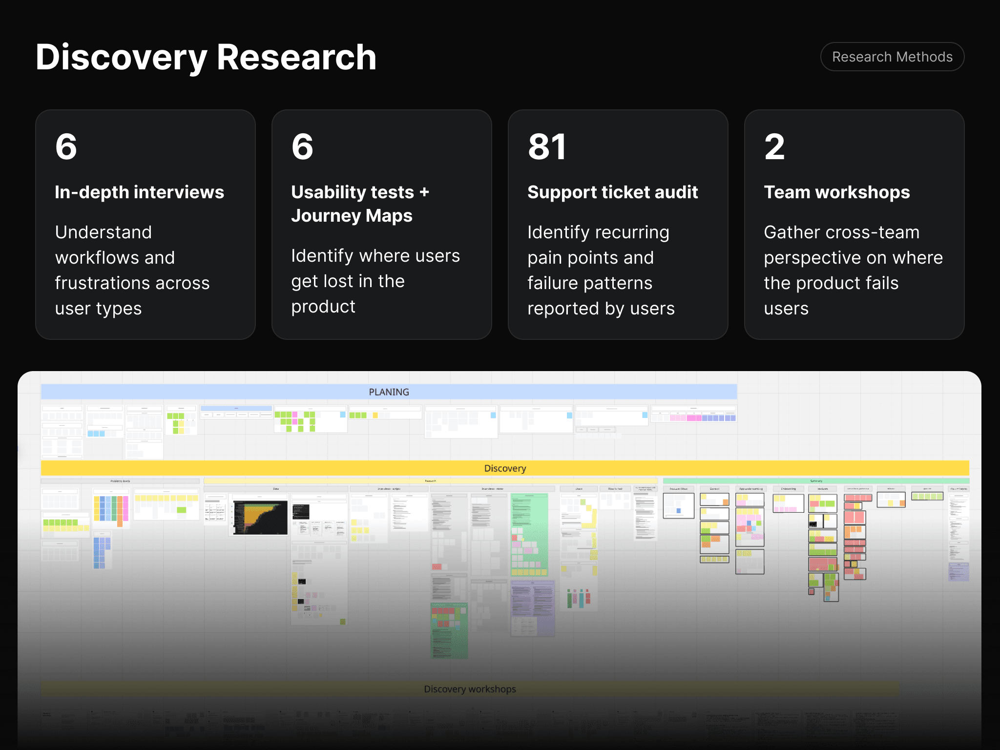
I conducted 6 in-depth interviews with a mix of user types — agency owners, team leads, and solo creators, ranging from new users to 3-year veterans. The goal was to understand real workflows, mental models, and frustrations across different levels of experience.
I conducted 6 in-depth interviews with a mix of user types — agency owners, team leads, and solo creators, ranging from new users to 3-year veterans. The goal was to understand real workflows, mental models, and frustrations across different levels of experience.
I conducted 6 in-depth interviews with a mix of user types — agency owners, team leads, and solo creators, ranging from new users to 3-year veterans. The goal was to understand real workflows, mental models, and frustrations across different levels of experience.


The journey map below traces a new user attempting to add their first creator — one of the most critical onboarding flows. It revealed a consistent pattern: users completed each step without understanding what it meant or what came next, leading to confusion at the License and OnlyFans login steps.
The tests revealed a lack of clear system states, unclear next steps, and usability issues, particularly around navigation and feature discoverability.
The journey map below traces a new user attempting to add their first creator — one of the most critical onboarding flows. It revealed a consistent pattern: users completed each step without understanding what it meant or what came next, leading to confusion at the License and OnlyFans login steps.
The tests revealed a lack of clear system states, unclear next steps, and usability issues, particularly around navigation and feature discoverability.
The journey map below traces a new user attempting to add their first creator — one of the most critical onboarding flows. It revealed a consistent pattern: users completed each step without understanding what it meant or what came next, leading to confusion at the License and OnlyFans login steps.
The tests revealed a lack of clear system states, unclear next steps, and usability issues, particularly around navigation and feature discoverability.
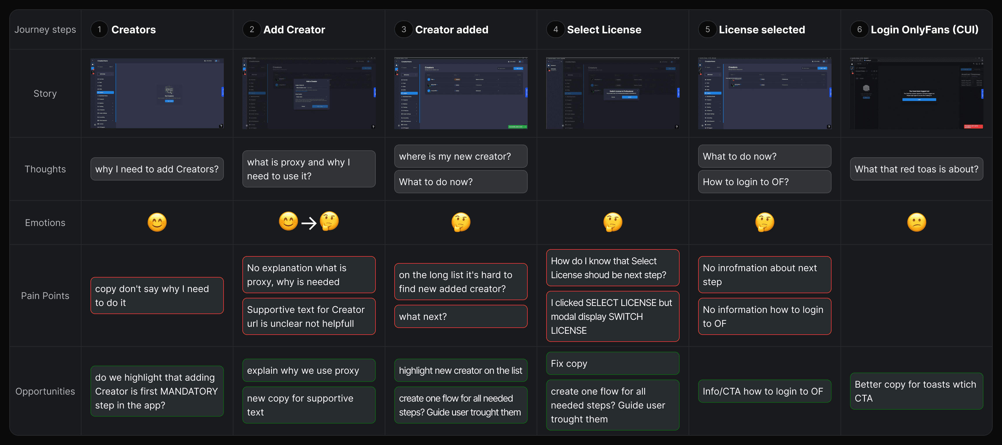
User Journey Map - Testing
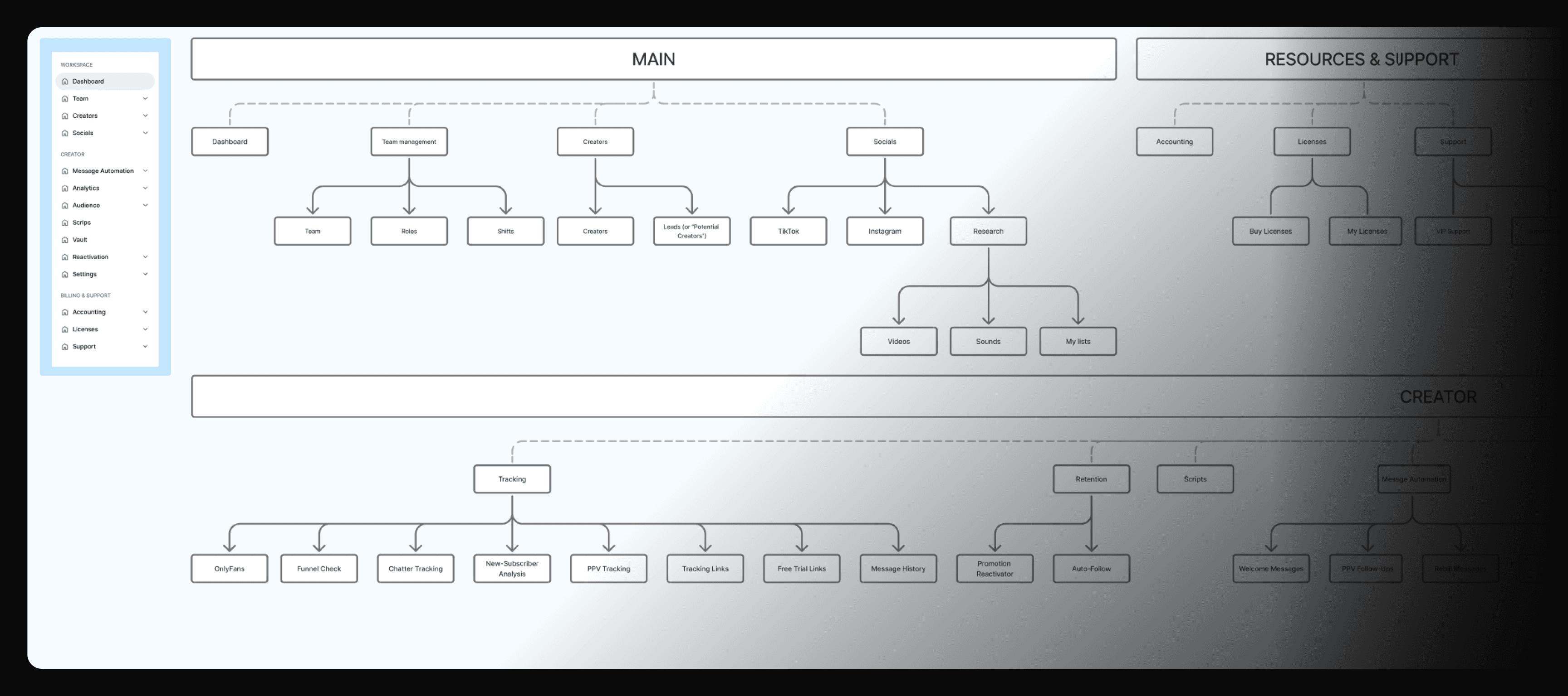
The original sidebar had 19 items with no clear grouping logic. Based on card sorting sessions with users, I restructured the navigation into three distinct groups — Main, Creator, and Resources & Support — reducing visible items to 11 and placing creator-specific features under a dedicated context. This directly addressed the finding that users couldn't locate features relevant to their current task.
The original sidebar had 19 items with no clear grouping logic. Based on card sorting sessions with users, I restructured the navigation into three distinct groups — Main, Creator, and Resources & Support — reducing visible items to 11 and placing creator-specific features under a dedicated context. This directly addressed the finding that users couldn't locate features relevant to their current task.
The original sidebar had 19 items with no clear grouping logic. Based on card sorting sessions with users, I restructured the navigation into three distinct groups — Main, Creator, and Resources & Support — reducing visible items to 11 and placing creator-specific features under a dedicated context. This directly addressed the finding that users couldn't locate features relevant to their current task.
Information Architecture
Key findings
1. The product is perceived as powerful but mysterious Users estimated they were using only 10–20% of the platform's potential. Not because features were missing — but because they were invisible, unexplained, or too complex to set up without external help.
2. Onboarding was the biggest drop-off point New users without a guided onboarding call didn't know where to start. The existing checklist used an external tool with a different design language. First-time flows — like adding a creator — left users with no clear next step after each action.
3. Stability and trust were critical for advanced users Agency operators and chatters weren't asking for new features — they needed the existing ones to work reliably. Incorrect financial data, ghost automation messages running after being disabled, and upload failures were eroding trust in the platform daily.
Key findings
1. The product is perceived as powerful but mysterious Users estimated they were using only 10–20% of the platform's potential. Not because features were missing — but because they were invisible, unexplained, or too complex to set up without external help.
2. Onboarding was the biggest drop-off point New users without a guided onboarding call didn't know where to start. The existing checklist used an external tool with a different design language. First-time flows — like adding a creator — left users with no clear next step after each action.
3. Stability and trust were critical for advanced users Agency operators and chatters weren't asking for new features — they needed the existing ones to work reliably. Incorrect financial data, ghost automation messages running after being disabled, and upload failures were eroding trust in the platform daily.
Key findings
1. The product is perceived as powerful but mysterious Users estimated they were using only 10–20% of the platform's potential. Not because features were missing — but because they were invisible, unexplained, or too complex to set up without external help.
2. Onboarding was the biggest drop-off point New users without a guided onboarding call didn't know where to start. The existing checklist used an external tool with a different design language. First-time flows — like adding a creator — left users with no clear next step after each action.
3. Stability and trust were critical for advanced users Agency operators and chatters weren't asking for new features — they needed the existing ones to work reliably. Incorrect financial data, ghost automation messages running after being disabled, and upload failures were eroding trust in the platform daily.
Consequence
These findings reframed the product roadmap. The core problem wasn't missing features — it was that users couldn't onboard and couldn't understand what they already had. Design recommendations shifted company priorities toward two areas: a clearer, more personalized onboarding flow, and making existing features self-explanatory without relying on documentation or support calls.
Consequence
These findings reframed the product roadmap. The core problem wasn't missing features — it was that users couldn't onboard and couldn't understand what they already had. Design recommendations shifted company priorities toward two areas: a clearer, more personalized onboarding flow, and making existing features self-explanatory without relying on documentation or support calls.
Consequence
These findings reframed the product roadmap. The core problem wasn't missing features — it was that users couldn't onboard and couldn't understand what they already had. Design recommendations shifted company priorities toward two areas: a clearer, more personalized onboarding flow, and making existing features self-explanatory without relying on documentation or support calls.

Onboarding redesign
Beyond fixing individual steps, I redesigned onboarding as a personalized flow. New users answer a few quick questions — their role, team size, and prior experience with similar tools — which tailors what they see next. Adding a creator, previously a separate and confusing step buried in the app, was moved directly into onboarding as the final step, turning the most critical activation action into part of the guided flow rather than something users had to discover on their own.
Onboarding redesign
Beyond fixing individual steps, I redesigned onboarding as a personalized flow. New users answer a few quick questions — their role, team size, and prior experience with similar tools — which tailors what they see next. Adding a creator, previously a separate and confusing step buried in the app, was moved directly into onboarding as the final step, turning the most critical activation action into part of the guided flow rather than something users had to discover on their own.
Onboarding redesign
Beyond fixing individual steps, I redesigned onboarding as a personalized flow. New users answer a few quick questions — their role, team size, and prior experience with similar tools — which tailors what they see next. Adding a creator, previously a separate and confusing step buried in the app, was moved directly into onboarding as the final step, turning the most critical activation action into part of the guided flow rather than something users had to discover on their own.

Onboarding banner
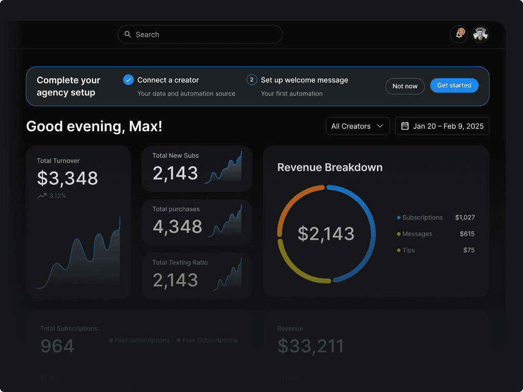
After completing the initial flow, users land on the dashboard with a persistent two-step banner: connect a creator, then set up their first automated welcome message — the product's flagship feature. This surfaces the platform's core value early, instead of leaving new users to stumble onto it later, and keeps onboarding visible without blocking access to the rest of the product.
Onboarding banner
After completing the initial flow, users land on the dashboard with a persistent two-step banner: connect a creator, then set up their first automated welcome message — the product's flagship feature. This surfaces the platform's core value early, instead of leaving new users to stumble onto it later, and keeps onboarding visible without blocking access to the rest of the product.
Onboarding banner
After completing the initial flow, users land on the dashboard with a persistent two-step banner: connect a creator, then set up their first automated welcome message — the product's flagship feature. This surfaces the platform's core value early, instead of leaving new users to stumble onto it later, and keeps onboarding visible without blocking access to the rest of the product.
Impact
Three months after launch, the redesigned onboarding increased completion rate from 36.7% to 55% — a jump of 18.3 percentage points. Drop-off at the highest-friction step fell from 41% to 18%, and conversion between creator setup and account login rose from 59% to 82%. More new users were reaching activation and completing onboarding than at any point before the redesign.
Impact
Three months after launch, the redesigned onboarding increased completion rate from 36.7% to 55% — a jump of 18.3 percentage points. Drop-off at the highest-friction step fell from 41% to 18%, and conversion between creator setup and account login rose from 59% to 82%. More new users were reaching activation and completing onboarding than at any point before the redesign.
Impact
Three months after launch, the redesigned onboarding increased completion rate from 36.7% to 55% — a jump of 18.3 percentage points. Drop-off at the highest-friction step fell from 41% to 18%, and conversion between creator setup and account login rose from 59% to 82%. More new users were reaching activation and completing onboarding than at any point before the redesign.
Redesign
When I joined, the design system had been built by two external agencies — inconsistent, unstructured, and living on a single Figma page. It was missing components, had two competing typography scales, multiple icon libraries, and no tokens for color, spacing, or radius.
I reorganized it into DS 1.1 as a first step — one component type per page, unified token system, consolidated libraries. This alone significantly accelerated daily design work, align FIgma with production and became the foundation for the full redesign that followed.
Redesign
When I joined, the design system had been built by two external agencies — inconsistent, unstructured, and living on a single Figma page. It was missing components, had two competing typography scales, multiple icon libraries, and no tokens for color, spacing, or radius.
I reorganized it into DS 1.1 as a first step — one component type per page, unified token system, consolidated libraries. This alone significantly accelerated daily design work, align FIgma with production and became the foundation for the full redesign that followed.
Redesign
When I joined, the design system had been built by two external agencies — inconsistent, unstructured, and living on a single Figma page. It was missing components, had two competing typography scales, multiple icon libraries, and no tokens for color, spacing, or radius.
I reorganized it into DS 1.1 as a first step — one component type per page, unified token system, consolidated libraries. This alone significantly accelerated daily design work, align FIgma with production and became the foundation for the full redesign that followed.

Redesign of Design System - (Legacy)

Logo
The legacy logo suffered from structural inconsistencies, including multiple symbol variants and excessive detail that failed at small scales, particularly in app icon usage.
The redesign introduced a simplified, geometric mark built around a strong “H” structure (hero mask concept), focusing on clarity, symmetry, and scalability. By removing unnecessary detail and refining the typography to support the symbol, the new identity creates a cohesive and modern foundation that works consistently across product and marketing touchpoints.
Logo
The legacy logo suffered from structural inconsistencies, including multiple symbol variants and excessive detail that failed at small scales, particularly in app icon usage.
The redesign introduced a simplified, geometric mark built around a strong “H” structure (hero mask concept), focusing on clarity, symmetry, and scalability. By removing unnecessary detail and refining the typography to support the symbol, the new identity creates a cohesive and modern foundation that works consistently across product and marketing touchpoints.
Logo
The legacy logo suffered from structural inconsistencies, including multiple symbol variants and excessive detail that failed at small scales, particularly in app icon usage.
The redesign introduced a simplified, geometric mark built around a strong “H” structure (hero mask concept), focusing on clarity, symmetry, and scalability. By removing unnecessary detail and refining the typography to support the symbol, the new identity creates a cohesive and modern foundation that works consistently across product and marketing touchpoints.

Logo redesign before/after
Pages / Features redesign
Header
Each dashboard change was driven by a specific research finding or usability issue — not aesthetic preference.
Throughout this project, I tackled challenges by designing numerous functionalities and user paths, including NFT Marketplace, Secondary Marketplace, and streamlined flows for creating, selling, and buying NFTs. I also crafted a community with premium content for fans, an artist list, user and artist profiles, and NFT pages.
Dashboard
Header
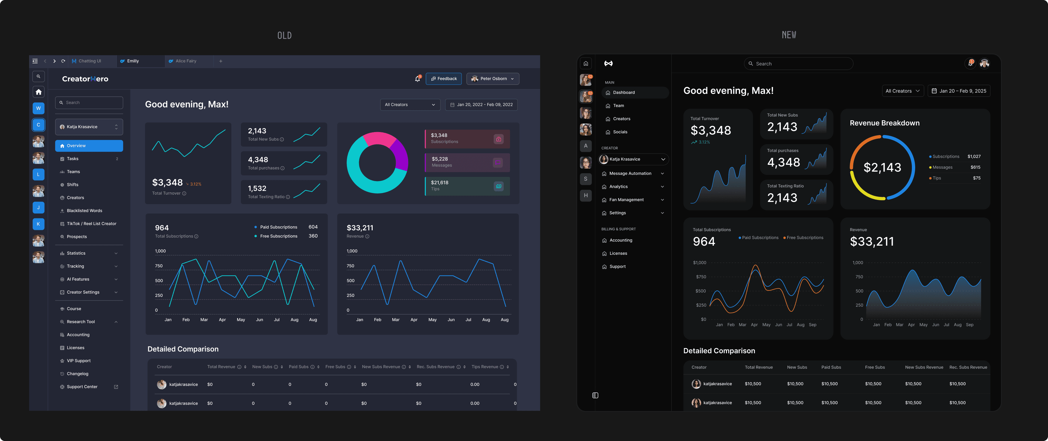
Main dashboard changes:
Main dashboard changes:
One main search
Initially app had two search inputs (sidebar and navbar) which merged in to one.Improve sidebar items grouping
Reduce items from 19 to 11. Regruping menu base on cart sorting with users. Adding groups tittles.Moving Creator Selector in to Creator group
Because selected creator affects only features from Creator group it was moved there.
One main search
Initially app had two search inputs (sidebar and navbar) which merged in to one.Improve sidebar items grouping
Reduce items from 19 to 11. Regruping menu base on cart sorting with users. Adding groups tittles.Moving Creator Selector in to Creator group
Because selected creator affects only features from Creator group it was moved there.
Redesign of dashboard
Creating Online Mass Message
Header
Complex flow of Creating Online Mass Message - feature which allows agencies to send targeted messages across multiple fan lists with granular controls.
Throughout this project, I tackled challenges by designing numerous functionalities and user paths, including NFT Marketplace, Secondary Marketplace, and streamlined flows for creating, selling, and buying NFTs. I also crafted a community with premium content for fans, an artist list, user and artist profiles, and NFT pages.
User research and product audits uncovered several issues in the automated message creation flow. Users frequently lost progress, skipped required fields, and struggled to understand the purpose and configuration of key features.
The redesign focused on reducing cognitive load and improving task completion. I introduced a sticky CTA bar, grouped related settings into logical sections, collapsed optional configurations, and added contextual explanations and message examples. A consistent form pattern—with inputs placed directly below labels and toggles aligned to the right—improved predictability and reduced the number of overlooked fields.
Throughout this project, I tackled challenges by designing numerous functionalities and user paths, including NFT Marketplace, Secondary Marketplace, and streamlined flows for creating, selling, and buying NFTs. I also crafted a community with premium content for fans, an artist list, user and artist profiles, and NFT pages.

Features design
A significant part of my role was defining and designing new product features from early concepts to production-ready solutions. Working closely with Product Managers and engineers, I translated product requirements and user needs into end-to-end flows, interactive prototypes, and detailed specifications.
Many of these features involved complex, multi-step interactions with multiple user scenarios, edge cases, and system states. My focus was to simplify these workflows while ensuring technical feasibility and consistency across the product, including support for both Light and Dark modes.
A significant part of my role was defining and designing new product features from early concepts to production-ready solutions. Working closely with Product Managers and engineers, I translated product requirements and user needs into end-to-end flows, interactive prototypes, and detailed specifications.
Many of these features involved complex, multi-step interactions with multiple user scenarios, edge cases, and system states. My focus was to simplify these workflows while ensuring technical feasibility and consistency across the product, including support for both Light and Dark modes.
AI Assistant
The AI assistant allows users to interact with CreatorHero through prompts, from querying data to making changes to app features. The design includes first-time adoption, quick suggestions, mindsets, and search results, ensuring transparency at every stage of the interaction.
The AI assistant allows users to interact with CreatorHero through prompts, from querying data to making changes to app features. The design includes first-time adoption, quick suggestions, mindsets, and search results, ensuring transparency at every stage of the interaction.

AICH
AICH automates fan conversations using AI. The design covers the full interaction flow — activation, active states, attention alerts, and manual override. Each state was designed to give users clear control without interrupting their workflow. Feature designed for selected agency clients in alpha then released in full version, designed in close collaboration with PMs and CEO.
AICH automates fan conversations using AI. The design covers the full interaction flow — activation, active states, attention alerts, and manual override. Each state was designed to give users clear control without interrupting their workflow. Feature designed for selected agency clients in alpha then released in full version, designed in close collaboration with PMs and CEO.

Website design
Designed and launched the CreatorHero blog from scratch — including page architecture, article layout, and a full component set. The entire design and Figma build was completed in two days. Within weeks of launch, the blog reached 162K monthly Google impressions and 6K+ organic clicks, becoming a key acquisition channel.
Website design
Designed and launched the CreatorHero blog from scratch — including page architecture, article layout, and a full component set. The entire design and Figma build was completed in two days. Within weeks of launch, the blog reached 162K monthly Google impressions and 6K+ organic clicks, becoming a key acquisition channel.

Results
All product features designed during the engagement were fully implemented by the development team — with zero handoff issues reported. The design system was praised by developers for its clarity and ease of implementation. The blog launched and reached 162K monthly Google impressions and 6K+ organic clicks within weeks, establishing a new acquisition channel for the brand.
All product features designed during the engagement were fully implemented by the development team — with zero handoff issues reported. The design system was praised by developers for its clarity and ease of implementation. The blog launched and reached 162K monthly Google impressions and 6K+ organic clicks within weeks, establishing a new acquisition channel for the brand.
"He has a great eye for design, and everything he shipped consistently looked sharp. He has opinions, brings his own ideas to the table, and isn't afraid to suggest a different direction when he thinks something can be better. If you need a designer who cares about craft and thinks for himself, Oskar is your guy."
— Yad Arkawazy, Head of Product, CreatorHero
"He has a great eye for design, and everything he shipped consistently looked sharp. He has opinions, brings his own ideas to the table, and isn't afraid to suggest a different direction when he thinks something can be better. If you need a designer who cares about craft and thinks for himself, Oskar is your guy."
— Yad Arkawazy, Head of Product, CreatorHero
"He has a great eye for design, and everything he shipped consistently looked sharp. He has opinions, brings his own ideas to the table, and isn't afraid to suggest a different direction when he thinks something can be better. If you need a designer who cares about craft and thinks for himself, Oskar is your guy."
— Yad Arkawazy, Head of Product, CreatorHero
Looking back
This project taught me that the most important design decisions aren't made in Figma — they're made before you open it. Starting with a full discovery phase, even when the pressure was to ship screens quickly, completely changed the direction of the product. The research didn't just inform the design — it reframed what the company was building toward.
Working as the sole designer across a complex, multi-surface product also sharpened my ability to prioritize ruthlessly, communicate design decisions clearly to non-designers, and build systems that could scale without me being the bottleneck.
The redesign wasn't fully shipped — but the design system, every feature flow, and the blog were. And the research changed the roadmap. That's the work I'm most proud of.
Looking back
This project taught me that the most important design decisions aren't made in Figma — they're made before you open it. Starting with a full discovery phase, even when the pressure was to ship screens quickly, completely changed the direction of the product. The research didn't just inform the design — it reframed what the company was building toward.
Working as the sole designer across a complex, multi-surface product also sharpened my ability to prioritize ruthlessly, communicate design decisions clearly to non-designers, and build systems that could scale without me being the bottleneck.
The redesign wasn't fully shipped — but the design system, every feature flow, and the blog were. And the research changed the roadmap. That's the work I'm most proud of.
Looking back
This project taught me that the most important design decisions aren't made in Figma — they're made before you open it. Starting with a full discovery phase, even when the pressure was to ship screens quickly, completely changed the direction of the product. The research didn't just inform the design — it reframed what the company was building toward.
Working as the sole designer across a complex, multi-surface product also sharpened my ability to prioritize ruthlessly, communicate design decisions clearly to non-designers, and build systems that could scale without me being the bottleneck.
The redesign wasn't fully shipped — but the design system, every feature flow, and the blog were. And the research changed the roadmap. That's the work I'm most proud of.
SEE NEXT PROJECTS


OSKAR TOMECKI
OSKAR TOMECKI