Solo Music
Deliverables:
Web Design, Design System
Solo Music
Deliverables:
Web Design, Design System
Solo Music
Deliverables:
Web Design, Design System
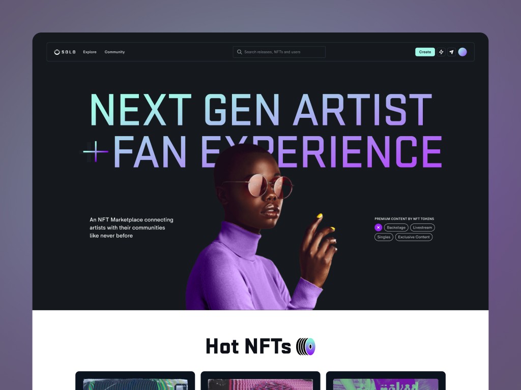
Solo Music is a Web3 platform tailored for musicians, facilitating easy distribution of digital collectibles to fans.
Solo Music is a Web3 platform tailored for musicians, facilitating easy distribution of digital collectibles to fans.
Solo Music is a Web3 platform tailored for musicians, facilitating easy distribution of digital collectibles to fans.


The Process
Data:
April 2022 – November 2022
The Process
Data:
April 2022 – November 2022
The Process
Data:
April 2022 – November 2022
1. Overview
SoloMusic is a Web3 platform tailored for musicians, facilitating easy distribution of digital collectibles to fans. Artists sell premium experiences directly — fans buy NFTs to unlock artist communities, exclusive content, live streams, and real-time chat.
I joined a 6-person cross-functional team as the sole designer, owning the project end-to-end: from kick-off workshops and UX research through information architecture, wireframes, design system, and final UI across mobile and desktop.
1. Overview
SoloMusic is a Web3 platform tailored for musicians, facilitating easy distribution of digital collectibles to fans. Artists sell premium experiences directly — fans buy NFTs to unlock artist communities, exclusive content, live streams, and real-time chat.
I joined a 6-person cross-functional team as the sole designer, owning the project end-to-end: from kick-off workshops and UX research through information architecture, wireframes, design system, and final UI across mobile and desktop.
1. Overview
SoloMusic is a Web3 platform tailored for musicians, facilitating easy distribution of digital collectibles to fans. Artists sell premium experiences directly — fans buy NFTs to unlock artist communities, exclusive content, live streams, and real-time chat.
I joined a 6-person cross-functional team as the sole designer, owning the project end-to-end: from kick-off workshops and UX research through information architecture, wireframes, design system, and final UI across mobile and desktop.
The Challenge
Building a web3-powered platform required balancing complex blockchain mechanics with a seamless, intuitive user experience. The overarching challenge was to design a highly scalable, secure, and unified ecosystem from scratch, while navigating a lack of established market patterns.
The Dual-User Ecosystem (Fans vs. Artists)
Designing a shared experience for two user archetypes with fundamentally opposing goals, behaviors, and access rights. The challenge lay in architecting a single, cohesive interface that dynamically adapts its depth and functionality based on the user profile, preventing system fragmentation.
Scaling Creation Without Cognitive Overload
The product needed to support radically different content types—from standard posts to NFTs and livestreams—alongside complex marketplace mechanics like multi-item collections. The challenge was architecting a clean, intuitive creation ecosystem from scratch that could handle these diverse technical requirements under a single entry point, without overwhelming the user or cluttering the UI.
Transaction State Models
The secondary marketplace required a multi-layered transaction system combining bidding, instant purchases, and dual payment rails (fiat and crypto). My main focus was architecting a bulletproof state model that made asynchronous blockchain transactions and edge cases crystal clear to users, maintaining trust at every step of the checkout flow.
Designing Gated Logic with Zero Benchmarks
We introduced a permission-based community system driven by NFT ownership. With no direct market references to learn from, I translated complex backend logic into intuitive, user-facing access states. I utilized extensive Miro mapping and interactive wireframes to align cross-functional stakeholders on system behavior and edge-case rules.

10Clouds + Solo Music team
The Challenge
Building a web3-powered platform required balancing complex blockchain mechanics with a seamless, intuitive user experience. The overarching challenge was to design a highly scalable, secure, and unified ecosystem from scratch, while navigating a lack of established market patterns.
The Dual-User Ecosystem (Fans vs. Artists)
Designing a shared experience for two user archetypes with fundamentally opposing goals, behaviors, and access rights. The challenge lay in architecting a single, cohesive interface that dynamically adapts its depth and functionality based on the user profile, preventing system fragmentation.
Scaling Creation Without Cognitive Overload
The product needed to support radically different content types—from standard posts to NFTs and livestreams—alongside complex marketplace mechanics like multi-item collections. The challenge was architecting a clean, intuitive creation ecosystem from scratch that could handle these diverse technical requirements under a single entry point, without overwhelming the user or cluttering the UI.
Transaction State Models
The secondary marketplace required a multi-layered transaction system combining bidding, instant purchases, and dual payment rails (fiat and crypto). My main focus was architecting a bulletproof state model that made asynchronous blockchain transactions and edge cases crystal clear to users, maintaining trust at every step of the checkout flow.
Designing Gated Logic with Zero Benchmarks
We introduced a permission-based community system driven by NFT ownership. With no direct market references to learn from, I translated complex backend logic into intuitive, user-facing access states. I utilized extensive Miro mapping and interactive wireframes to align cross-functional stakeholders on system behavior and edge-case rules.
The Challenge
Building a web3-powered platform required balancing complex blockchain mechanics with a seamless, intuitive user experience. The overarching challenge was to design a highly scalable, secure, and unified ecosystem from scratch, while navigating a lack of established market patterns.
The Dual-User Ecosystem (Fans vs. Artists)
Designing a shared experience for two user archetypes with fundamentally opposing goals, behaviors, and access rights. The challenge lay in architecting a single, cohesive interface that dynamically adapts its depth and functionality based on the user profile, preventing system fragmentation.
Scaling Creation Without Cognitive Overload
The product needed to support radically different content types—from standard posts to NFTs and livestreams—alongside complex marketplace mechanics like multi-item collections. The challenge was architecting a clean, intuitive creation ecosystem from scratch that could handle these diverse technical requirements under a single entry point, without overwhelming the user or cluttering the UI.
Transaction State Models
The secondary marketplace required a multi-layered transaction system combining bidding, instant purchases, and dual payment rails (fiat and crypto). My main focus was architecting a bulletproof state model that made asynchronous blockchain transactions and edge cases crystal clear to users, maintaining trust at every step of the checkout flow.
Designing Gated Logic with Zero Benchmarks
We introduced a permission-based community system driven by NFT ownership. With no direct market references to learn from, I translated complex backend logic into intuitive, user-facing access states. I utilized extensive Miro mapping and interactive wireframes to align cross-functional stakeholders on system behavior and edge-case rules.
3. Discovery
The project started with a 2-day Lean Inception workshop — aligning the team on vision, scope, and priorities before any design work began. We mapped user personas, defined must-have vs. nice-to-have features, and identified the riskiest assumptions to validate.
Following the workshop, I analyzed the competitive landscape extensively, ran surveys, and conducted 5 structured in-depth interviews with artists and fans.
3. Discovery
The project started with a 2-day Lean Inception workshop — aligning the team on vision, scope, and priorities before any design work began. We mapped user personas, defined must-have vs. nice-to-have features, and identified the riskiest assumptions to validate.
Following the workshop, I analyzed the competitive landscape extensively, ran surveys, and conducted 5 structured in-depth interviews with artists and fans.
3. Discovery
The project started with a 2-day Lean Inception workshop — aligning the team on vision, scope, and priorities before any design work began. We mapped user personas, defined must-have vs. nice-to-have features, and identified the riskiest assumptions to validate.
Following the workshop, I analyzed the competitive landscape extensively, ran surveys, and conducted 5 structured in-depth interviews with artists and fans.
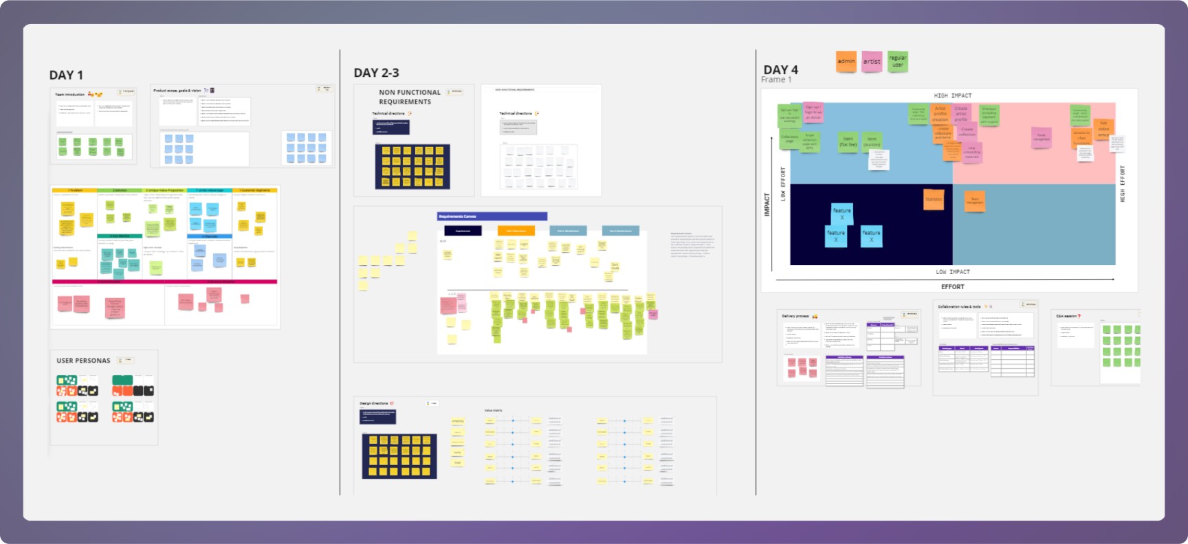
Miro from workshops

5 users Interviews
4. Defining the Problem — User Flows, IA, User Stories
During the workshops we created 7 main user flows, which I polished later. I also mapped the full Information Architecture of the platform and created user stories for key scenarios. This revealed the true scale of the project, allowed us to plan sprints well, and set the stage for efficient Lo-Fi design and team communication.
4. Defining the Problem — User Flows, IA, User Stories
During the workshops we created 7 main user flows, which I polished later. I also mapped the full Information Architecture of the platform and created user stories for key scenarios. This revealed the true scale of the project, allowed us to plan sprints well, and set the stage for efficient Lo-Fi design and team communication.

User Flows

Information Architecture

Miro with comunity page logic
5. Wireframes
In a few days I designed wireframes for the full scope of the project — deliberately lo-fi, focused on speed and alignment. The community page went through the most iterations, testing how to layer access states, premium content previews, and social features.
5. Wireframes
In a few days I designed wireframes for the full scope of the project — deliberately lo-fi, focused on speed and alignment. The community page went through the most iterations, testing how to layer access states, premium content previews, and social features.

Wireframes
6. Design System & Visual Direction
The visual direction was defined through 2 moodboards created during branding discovery workshops — with a voting mechanism so the client could choose inspirations that resonated most. Since our users come from music and culture, the aesthetic needed to be visually ambitious.
6. Design System & Visual Direction
The visual direction was defined through 2 moodboards created during branding discovery workshops — with a voting mechanism so the client could choose inspirations that resonated most. Since our users come from music and culture, the aesthetic needed to be visually ambitious.

Moodboards
Style tiles
From the chosen visual direction I created style tiles — presenting colors, typography, key components, and mockup samples.
Style tiles
From the chosen visual direction I created style tiles — presenting colors, typography, key components, and mockup samples.

Style tiles
Design System
The design system was then built from scratch, covering all core components across mobile and desktop
Design System
7. Final Interface & System Output
The final UI showcases the full end-to-end experience across mobile and desktop, including the NFT marketplace, dual-state community experience, artist and user profiles, livestream, chat, and content creation flows.
7. Final Interface & System Output
The final UI showcases the full end-to-end experience across mobile and desktop, including the NFT marketplace, dual-state community experience, artist and user profiles, livestream, chat, and content creation flows.

Hi-Fi screens
Prototype
Prototype
The prototype highlights the creator flow for minting and publishing NFTs, demonstrating how complex creation logic was simplified into a guided, step-based experience.
The prototype highlights the creator flow for minting and publishing NFTs, demonstrating how complex creation logic was simplified into a guided, step-based experience.
Additional explorations include hero section variations and early visual direction concepts, as well as responsive layouts across breakpoints to ensure consistency of experience across devices.

Create NFT flow
Hero section exploration
Hero section exploration
Additional explorations include hero section variations and early visual direction concepts, as well as responsive layouts across breakpoints to ensure consistency of experience across devices.
Additional explorations include hero section variations and early visual direction concepts, as well as responsive layouts across breakpoints to ensure consistency of experience across devices.

Hero section exploration
RWD
In the project I used 5 break points to ensure that all components scale properly to facilitate project implementation.

RWD
8. Results / Looking Back
Working in a 6-person cross-functional team, we delivered the MVP in 3 months, followed by 4 months of feature development. The project was also recognized internally, with the wider team publicly praising how smoothly the collaboration ran.
The client rated the final product 5.0 out of 5, describing it as "a simple, good-looking product with a thoughtful, intuitive flow." The visual direction — built around custom illustrations and a bold Web3 aesthetic — was called out specifically as giving the platform "great vibe and lots of musical analogies," helping it stand out in a crowded market.
SoloMusic remains one of the most complete end-to-end projects I've worked on — from discovery through a fully built design system and shipped UI across mobile and desktop.
8. Results / Looking Back
Working in a 6-person cross-functional team, we delivered the MVP in 3 months, followed by 4 months of feature development. The project was also recognized internally, with the wider team publicly praising how smoothly the collaboration ran.
The client rated the final product 5.0 out of 5, describing it as "a simple, good-looking product with a thoughtful, intuitive flow." The visual direction — built around custom illustrations and a bold Web3 aesthetic — was called out specifically as giving the platform "great vibe and lots of musical analogies," helping it stand out in a crowded market.
SoloMusic remains one of the most complete end-to-end projects I've worked on — from discovery through a fully built design system and shipped UI across mobile and desktop.

Feedback from clients and team meambers
Design System
The design system was then built from scratch, covering all core components across mobile and desktop
RWD
In the project I used 5 break points to ensure that all components scale properly to facilitate project implementation.
SEE NEXT PROJECTS


OSKAR TOMECKI
OSKAR TOMECKI